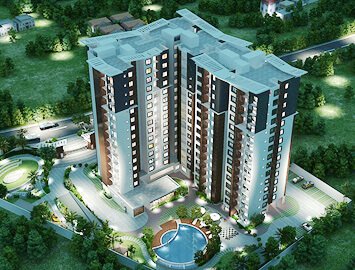
 Ongoing Projects
 Ongoing Projects
The 'Smart-n-Warm' Home Automation System for "Leaves" enables the dream of smart living for modern Indians
in unique and cost effective manner.
READ MORE The identity of “SUMO GROUP” is a proven integration of success and growth and also Sustainable growth. The group promises integrity and respect in all our endeavors, our values guide; our behavior and character and the way in which we communicate to corporate world.
The graphic element embedded with logotype “SUMO” is an integral part of the corporate identity. Conceptually this icon represents “Nurturing Growth”, the icon has three parts; first part represents the Sun- the energy source, the second part is a leaf element- a budding sapling, the last portion which forms the base, the hand element which blends into characters ‘S’ & ‘G’ indicates success and Growth, which is evolved over the years into sustainable growth.

 Ongoing Projects
  Completed Projects
  Upcoming Projects